
Membership of Type allows unlimited access to our online library. Join to support new research and writing on the design of the built environment.
You can read more about membership here.
Already a member? Login to your account to avail of unlimited downloads.
Membership of Type allows unlimited access to our online library.
Join to support new research and writing on the design of the built environment.
You can read more about membership here.
Individual Membership Fees
Individual membership is available on a monthly or annual basis.
The fee is €10/month or €99/year.

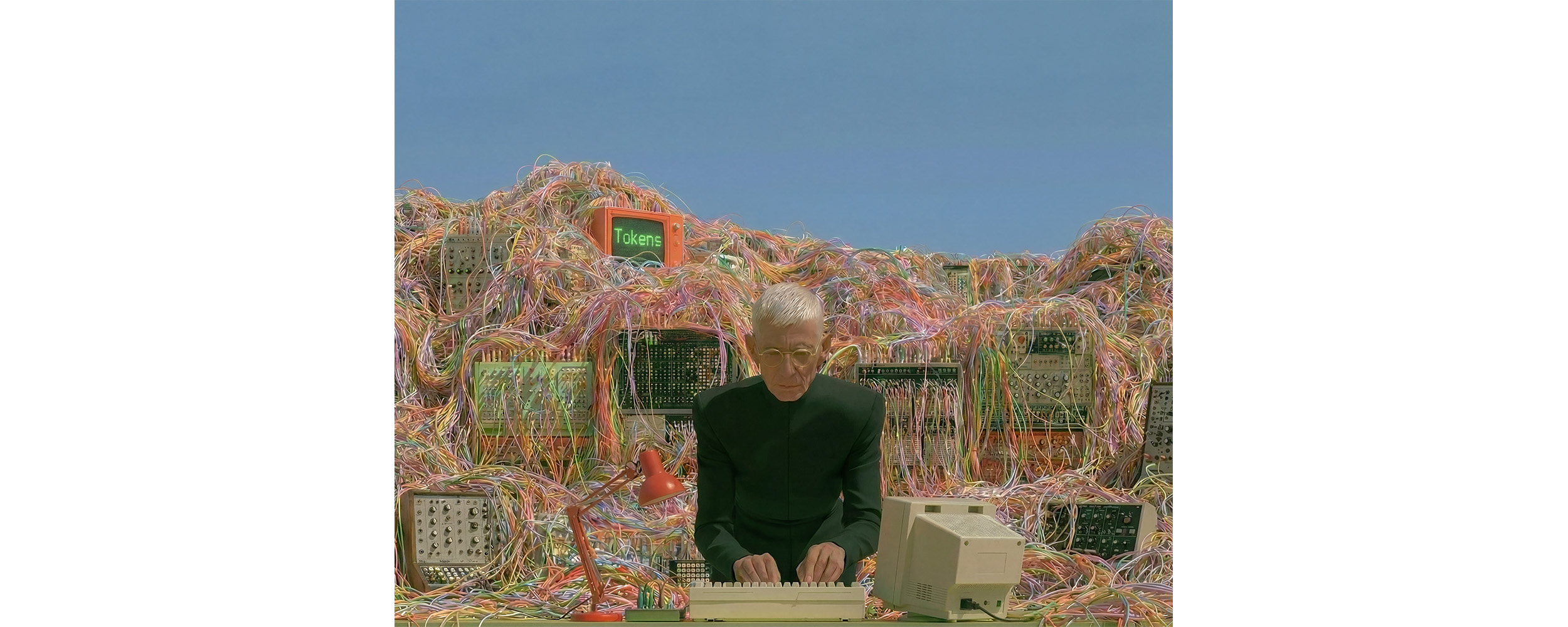
The public release of OpenAI’s artificial intelligence (AI) chatbot Chat-GPT has recently brought AI to the forefront of the public imagination. Alongside mass fascination with its capabilities and potential uses, its rollout has been accompanied by ardent discussions around the legibility, trustworthiness, accountability, and even agency of AI programmes. For specialists, these issues are far from new, and the design-inflected question of AI explainability has been a pressing concern for programmers and user-interface experts for some time [1].
These recent debates have seen a resurfacing of the language of ‘black boxes’ in a broad public forum. In this context, the phrase is often used critically to conceptualise an understanding gap between a system and its users. It refers to an unknowable space that emerges when a system cannot easily ‘show its working’ to either its users or designers. For many, an accusation of a platform either being or incorporating a black box relates to the impossibility of full control or oversight over it. This typically arises from a lack of comprehension of the inner workings of that system. Prompts go into a black box style algorithm, and information comes out, but the connection between the two cannot be fully understood, even by its programmers [2].
In other words, the computational metaphor of a black box is not associated with colour or form, but with the notion that a system’s output can not necessarily be deciphered by analysing its inputs. It operates as an unknowable function in the passage of information. The sense of it performing like a ‘box’ has little to do with storage, but rather relates to an intractable containment of hidden knowledge that creates ethically-significant problems of causality (cause and effect) and accountability. For similar, largely symbolic, reasons, the terminology of black boxes finds another well-known (mis)use in the field of aviation. Again, the persistent metaphor is associated with the containment of something, in this case, the rarefied information about events that transpired in the final minutes of an ill-fated aircraft. In both, a black box metaphor appears at a moment of uncertainty between causes and effects.
The design of theatre auditoriums can help to conceptualise some of the consequences of living with black boxes at a human scale and in a spatial sense. In his influential book Suspensions of Perception: Attention, Spectacle and Modern Culture, cultural theorist Jonathan Crary points to the adaptations that Richard Wagner made to the design of the Festspielhaus in Bayreuth as a turning point in the dramatist’s ability to dominate audience attention [3]. This purpose-built festival hall, opened in 1876, saw Wagner make now-famous infrastructural interventions that would, he hoped, encourage his audiences to engage with the fictional worlds presented onstage in a more absorbed, even hypnotic way. Removing the sideways facing booths from the seating, visually shielding his orchestra from the audience and dimming the lights in the auditorium are perhaps the best cited examples of the type of adaptations he demanded.

Crary, however, emphasises the significance of a less well-known innovation, an optical effect that would go on to be known as Wagner’s ‘mystic abyss’, in achieving a desired totalising engrossment of his audience in the presented scene [4]. This effect – the ‘mystic abyss’ – refers to the intentional insertion of unknowable distance between the stage space and auditorium achieved by separating the two with a series of receding, perspective-distorting proscenium arches. This intervention disrupted all continuous sight lines between stage space and the auditorium, thus perceptively and epistemologically severing the visual bonds between real space and fiction. In so doing, the mystic abyss demanded that audience members undergo a more fully-realised abandonment within the scene presented. They were encouraged to ‘pick a side’ between fiction and reality in a perceptive sense.
Contemporary black box theatres, arguably and ironically, represent a move away from these hallucinatory priorities. While on the one hand, some elements carry an inheritance from Wagner and early modern scenographers (their blank flexibility, typically low house-lighting and matt-black surfaces that visually privilege the fictional space on stage) on the other hand, their frequent ‘in the round’ layout means that their audiences tend to be more self-aware and often have the impression of sharing the event space with the performers. Again, the metaphorical name black box does not refer to their colour or shape, but rather to a more generalised aesthetic of containment of a space of fiction in a self-consistent interiority (box), supported by a humility of the playing space that bends to meet the various fictions that inhabit it (black). Unlike Wagner’s passive, hypnotised audiences, stripped of autonomy – if we are to follow Crary on this – these groups inhabit the same forum as the performers [5]. In this case, the ‘suspension of disbelief’ tends to be requested rather than insisted upon as the border of the theatrical universe is situated close to the entrance to the auditorium rather than between proscenium arches.
In a theatrical black box – unlike an AI-powered chatbot or a flight responder – the human element is ‘on the inside’, sharing a space and collaborating somewhat in the event that is live theatre. It might be hard to convey the full essence of what happens within a temporary theatrical universe to someone who never saw the show, but each event is always a joint venture.
The question of explainability in AI is not a settled issue in computer science, with some developers believing that too much potential is lost in the process of making an algorithm fully explainable to humans. In the context of these decisions being made away from the public forum, it is important for the rest of us to consider what costs must be paid in terms of accountability and autonomy in exchange for the enchantment and wonder earned across a mystic abyss.


Future Reference is supported by the Arts Council through the Architecture Project Award Round 2 2022.
These difficult questions are not idle speculation. The capabilities of AI are increasing by the day, and our long-held convictions on creativity and design are being questioned [1]. Personally, I have transitioned from working fifteen years as an architect and I now lead AI development, strategy and research at a large architectural practice. I have been observing these tools being used at every project stage and can see areas where they are working and are not. One thing I believe is certain, is that the way we have worked previously is now broken.
Irrespective of whether you're sceptical on AI, unconvinced by what you've seen, or if you've already integrated AI tools in your armoury and are familiar with how they are transforming work from the inside, the context to AI's role in creative work is constantly and rapidly changing. Some are less concerned about the capabilities of AI and more about the consequences for the industry, the values, and above all, its impact on people. These are all valid concerns.
Whether AI can design, and whether AI can be creative, are two different questions. Conflating these questions is where most of the current debate loses its footing. AI's capacity to design, in the sense of performing the tasks that constitute a design process, is largely a question of model capability, and the answer is changing at a pace that is difficult to keep up with. We are arriving at a point where AI agents can begin to orchestrate parts of the process, but without meaningful guidance they have no understanding of why they are doing what they are doing. The creative process is not always linear and is often not compatible with delegation. It does not move through predictable stages with clear milestones. It is continuous, unstructured, at times chaotic, and the understanding that guides it is often something a designer knows intuitively but can often find difficult to articulate, even to themselves. An agent can follow a sequence, but it cannot feel its way through one.
Whether AI can be creative is a question of a different order entirely, one that sits closer to what it means to understand something, to care about it, and to make something in response to that understanding. Creatives are perhaps better placed than anyone to navigate this technological shift, because the answer to the article's question has less to do with what the technology can do and more to do with what we can and will always bring to our work.
Architect and theorist Christopher Alexander devoted much of his career to a question that is simple to ask and very difficult to answer: why do certain places feel deeply, immediately right in a way most people sense but few can put into words. Alexander described design as a search for good fit between form and context, where context meant not a background condition but the full weight of human needs, constraints and relationships easy to miss unless fully understood; 'We are searching for some kind of harmony between two intangibles: a form which we have not yet designed and a context which we cannot properly describe'[2]. His concern was that reducing design thinking to a transferable system passes on the logic but loses the life. Production is a large part of the work we do, but the harder challenge has always lain elsewhere. That gap between systematic knowledge and embodied understanding is exactly what AI now forces us to confront again.

Ethan Mollick, a professor and leading researcher on AI & innovation and its impact on society, describes the form of AI we have ended up with as 'deeply weird in ways that we don't fully understand yet'[3], and warns that treating it like any other tool will always produce less useful outcomes than implementations that embrace that weirdness. My observation in architectural practice, is that the people who are most willing to lean into that strangeness are the ones most capable of influencing design direction, approaching these tools out of deep curiosity [4]. AI only flattens creative work when it is used to seek the average and remove judgement from the process. When designers invite the strange instead, it can lead to something genuinely intriguing.
What AI tools can offer, more than anything else, is freedom. Freedom to explore further, to reach into areas that once felt out of range, to test an idea without the weight of technical limitation slowing the thinking down. Designers are following their curiosity into new territory and finding that the boundaries they once worked within were never as fixed as they seemed. The curious are building their own tools entirely, which is perhaps the purest expression of that freedom, moulding the technology around their imagination rather than the other way around.
We come to the realisation that the process can be delegated, but the understanding behind it cannot. This is not a new concept, and it has always been framed as something existential. CAD was going to be the demise of the art of drawing, CGI was going to hollow out cinema, the sewing machine was going to end fashion as a craft and of course the video killed the radio star. Each time, the creative industry absorbed the tool, expanded its reach and moved onto the next challenging question. The pattern is consistent enough to resist the urge to panic.
So, is creativity still inherently human? My immersion into the space between suggests to me that the answer is yes, and the more capable these tools become, the more important it is to understand why. What AI offers is the removal of friction between a designer and the full scope of their thinking, and while that is incredibly valuable, it is not the same thing as being creative. Creativity is not something the tools produce. It is what we bring to them, the direction we set, the judgements we make, the willingness to keep questioning whether the work is right until we believe that it is.
Alexander asked this question before the tools existed and arrived at the same place: creativity lives in understanding, and understanding remains ours to develop or to neglect. The future belongs to those willing to embrace curiosity.
Disclosure of the use of AI is an important aspect of the work that I do. For transparency: I have used Wisprflow to dictate my thoughts, and Anthropic's Claude Sonnet 4.6 to map these themes for the article concept. The article was edited in collaboration with Cormac from TYPE through phone conversations and document exchanges. The images throughout have been generated with MidJourney. The content and ideas behind the article are my own.
Creativity has long been the human capacity we considered beyond the reach of any machine. Most can agree that Artificial Intelligence (AI) has crossed the threshold of being on the periphery to our work and is now embedding itself into our thinking, our workflows, and our society. As these shifts begin influencing the creative industries, we have to ask: what truly changes, and is creativity still what makes us human?
Read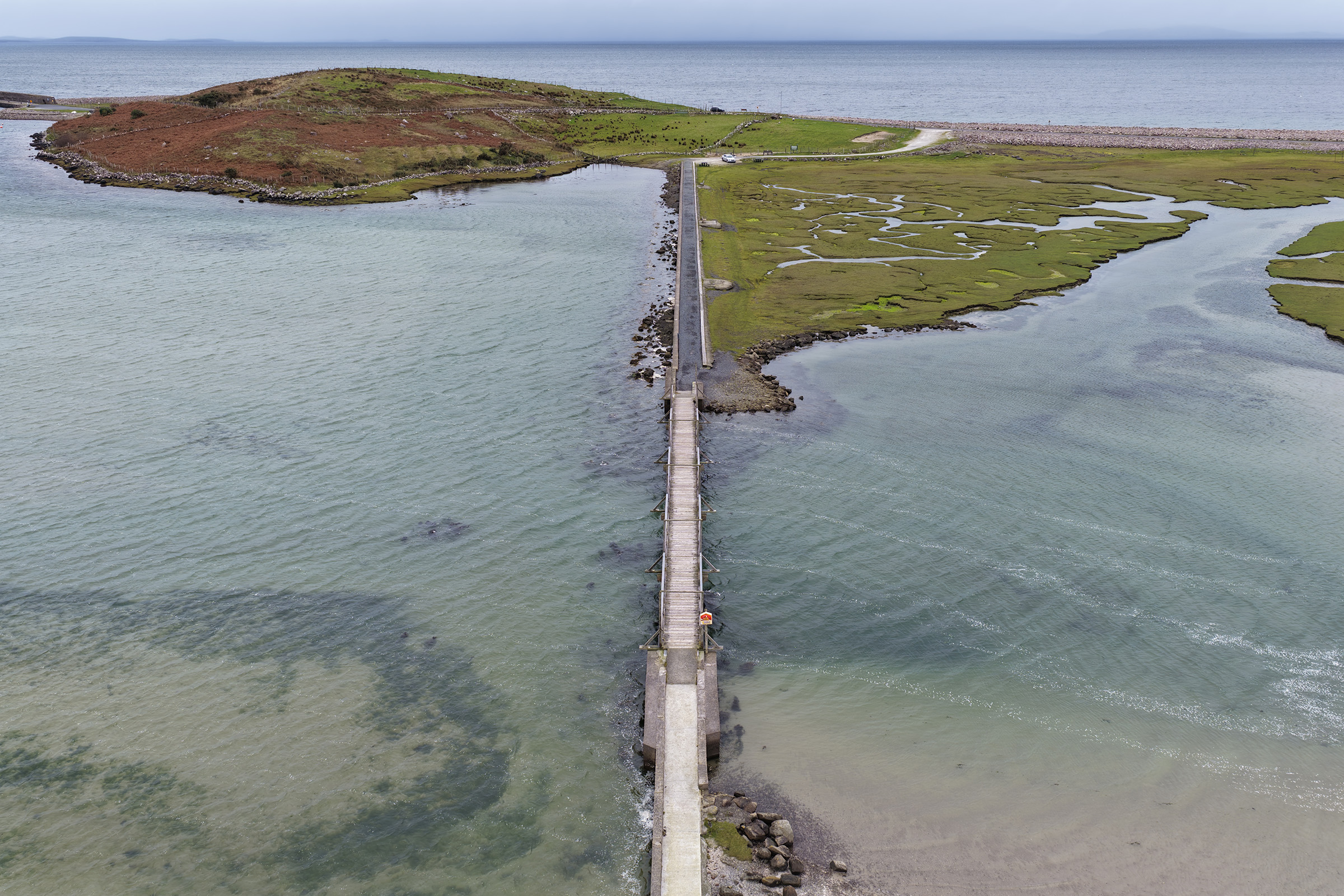
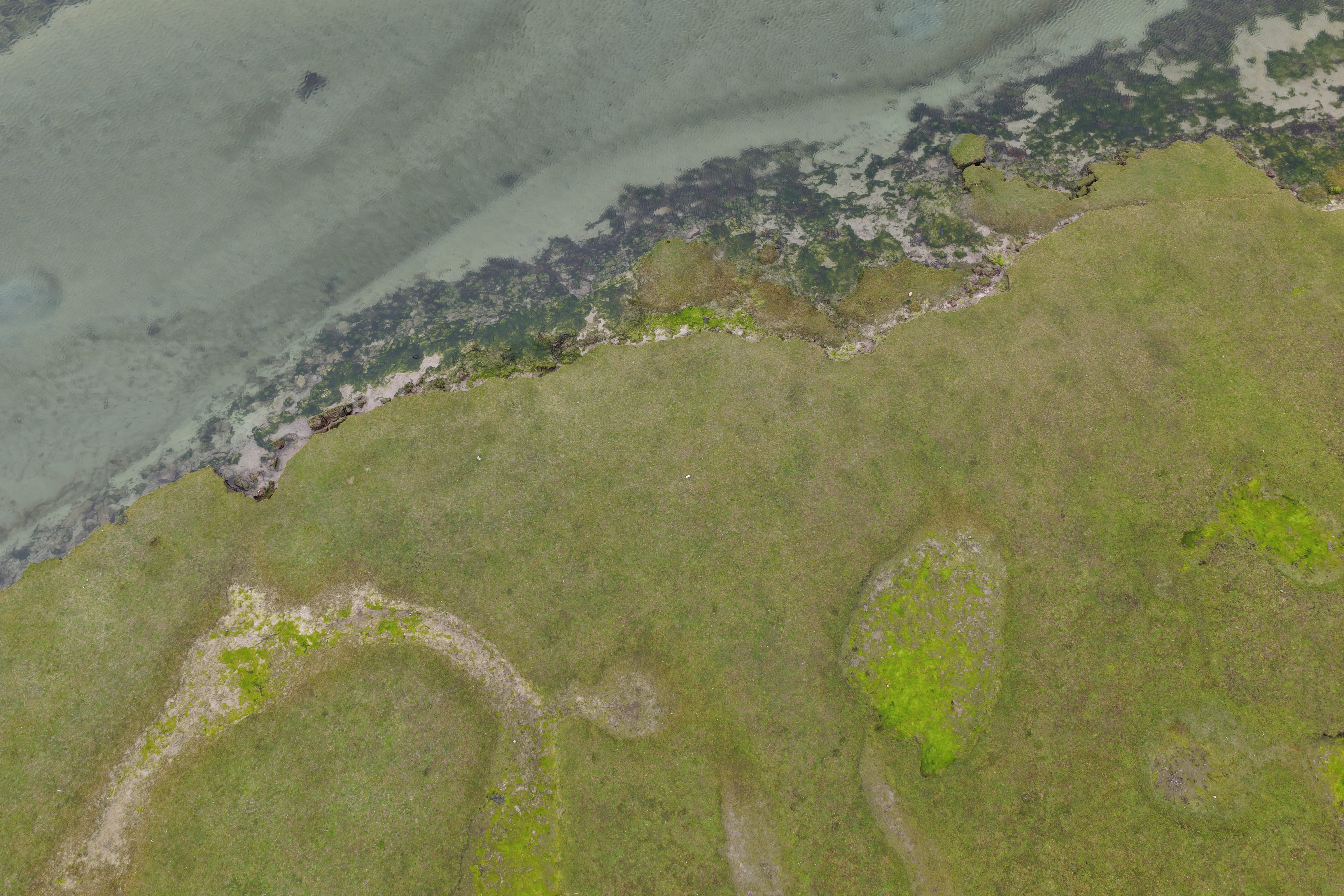
In 2024, Coastal Register received the SOM Foundation European Research Prize [1], an architectural research-for-practice project at the coast of Mulranny in County Mayo - a national Decarbonising Zone (DZ) with an objective of reducing carbon emissions by 51% by 2030 [2]. Across three phases - framework, fieldwork, groundwork - the project engages with the community, stakeholders, cross-disciplinary researchers and practitioners, and politicians. An emphasis emerged on data collection as a method of bridging consultation and capital funding, underpinning protective / restorative landscape-based design interventions, and linking research and practice with policymaking.
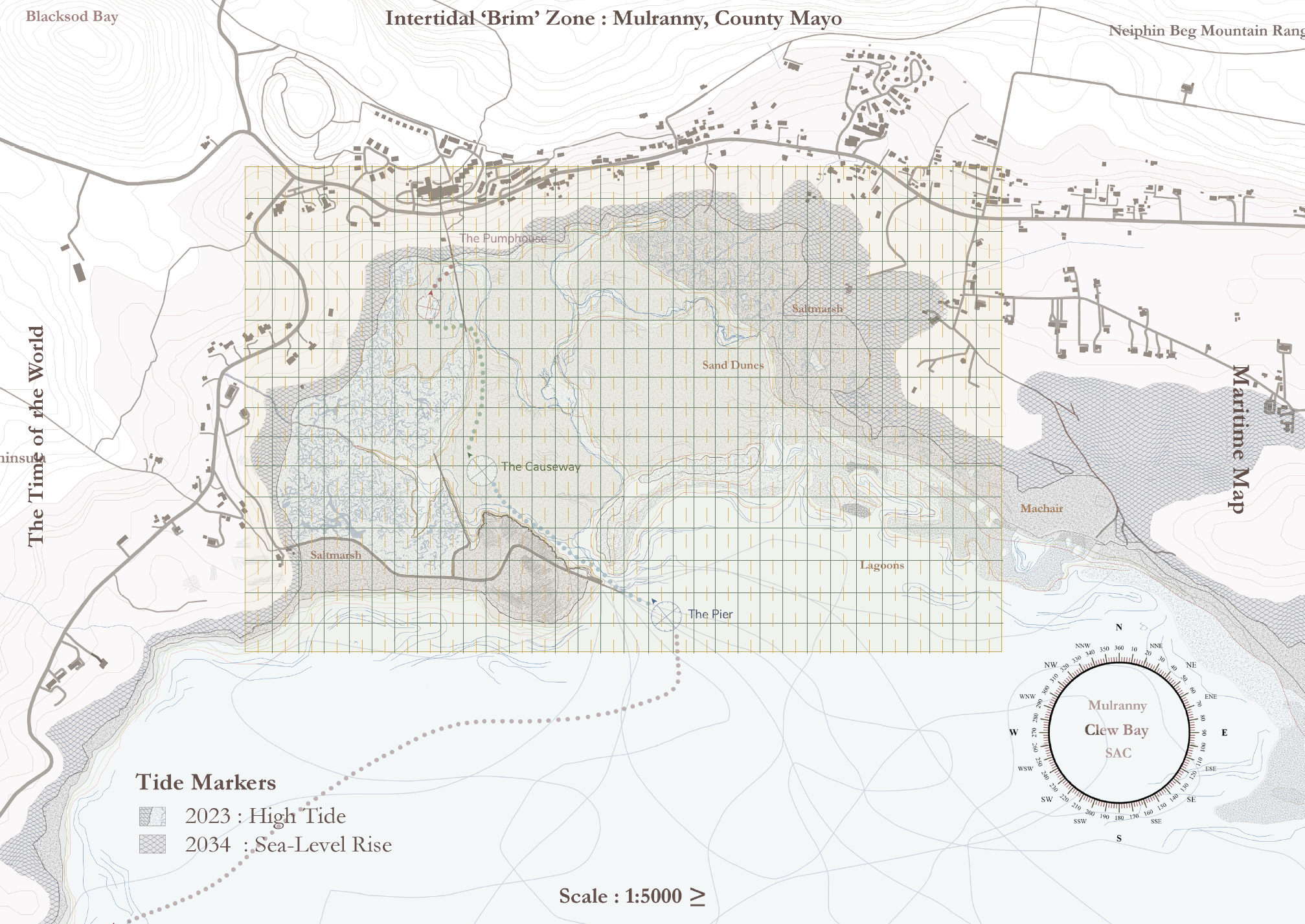
Within this context, it is a timely moment to focus on policymaking - not because the coast has suddenly become unstable, but because its instability is becoming impossible to ignore. Writing in April, after a winter of storms, the aftermath is now visible: collapsing paths, retreating edges, failing infrastructure. At the same time, this is the point in the year when reports are published, priorities set, and funding decisions made. It is a moment suspended between damage and response - when policymaking becomes most consequential. In this context, Mulranny DZ is acting as a test-site for examining whether existing research, practice and policy frameworks are equipped to address complex coastal challenges.
In its basic sense, the coastline is the boundary between terrestrial and marine environments - where land meets sea. However, the coast is not a permanent line drawn on a map, but a dynamic system in which land and sea are constantly eroding and accreting in response to natural and human time-scales [3]. Historically, the response to coastal erosion is to build structures for resistance, ensuring this boundary remains fixed. This is done under the assumption that the coastline has always been in its current position and must never be allowed to change. However, coastal processes operate on a parts-to-a-whole relationship. For example, building a sea wall in front of an eroding cliff may stop that area from eroding, but it also stops sediment from that eroding cliff from entering the coastal sediment budget. If this sediment is supplying beaches down drift, these beaches would erode. Hence, solving one erosion problem has created another, embedding a cycle in which each intervention necessitates another [4]. Over time, this defensive logic has been institutionalised through engineering standards, planning systems, and funding mechanisms which prioritise site-based resistance over system-scale processes [5].
This assumption is now being questioned, with research proving the effectiveness of ‘soft’ nature-based solutions over traditional ‘hard’ infrastructure. NATURESCAPES demonstrates how saltmarshes attenuate wave energy and function as adaptive coastal protection infrastructures [6], while SLOWATERS builds agricultural land through water retention measures [7]. Studies in the Maharees [8] and Grattan Beach [9] examine dune systems as socio-ecological landscapes shaped by governance. BLUE C positions wetlands as carbon-sequestering systems [10], while SWAMP investigates measures to improve water quality in peatlands [11]. Taken together, their work makes clear that the issue is not a lack of knowledge, but the absence of policy frameworks capable of acting on that knowledge at the large-scale at which coastal systems operate.
.jpg)

At Mulranny, data collection has become a design practice rather than a preliminary step, operating as a mechanism for both design and policy action. Rather than introducing infrastructure to control natural processes, at this stage the project proposes light-touch infrastructure for recording cultural, ecological, and legislative conditions through drawing, mapping, and photography - such as plinths that direct repeat photography towards calibrated viewpoints. This is producing an evidence base that can support both design decisions and the buy-in, risk, need, and impact required for capital funding. By involving the community as citizen scientists, the project also raises awareness of coastal change. In doing so, it aims to reduce reliance on reactive interventions and support the saltmarsh as primary infrastructure - a first, rather than last, line of defence.
If research and practice are aligning, why does implementation remain so slow? With Paul Lawless, I posed parliamentary questions and found that Ireland’s policy context is fragmented.
A key challenge was simply identifying who is responsible for managing the coast. The answer is not one particular Government department – rather, at least nine departments have jurisdiction over the coast, alongside layers of commonage and private ownership [12]. It is also problematic that approximately twenty public bodies with a remit in this area have their own governance structures and policy objectives and never the twain shall meet.
This fragmentation extends to the data that underpins investment. Baseline infrastructural and ecological recording is incomplete. There is no national inventory of coastal infrastructure [13], meaning we lack an understanding of what exists, requires maintenance, and who is responsible. A national survey of saltmarshes was carried out in 1998 [14], and the Saltmarsh Monitoring Project was then setup between 2006–2008 [15], with limited partial revisits in 2016–2017 [16] and no subsequent monitoring programme since - leaving gaps of over a decade between site observations.
Even ownership of the coast is not straightforward. While the Foreshore Act 1933 / Maritime Area Planning Act 2021 presumes the foreshore to be state-owned, this presumption is not absolute, and the spatial extent of state- and privately-owned foreshore has not been comprehensively delineated [17]. This is further complicated by coastal change and historic reclamation, where legal boundaries do not consistently align with physical landscapes [18]. In practice, licences may be issued for areas the State is assumed to own, despite the absence of a clearly defined spatial or legal framework [19]. This creates uncertainty in decision-making and presents practical barriers for communities and local authorities.
These issues are compounded by the absence of an overarching policy framework. Despite thirty years of discussion documents and legislative proposals, Ireland remains the only island nation without a national coastal management strategy [20 a, b], with only a report outlining how one might be prepared [21 a, b]. The National Landscape Strategy has lapsed without replacement [22]. The committee drafting Ireland’s Nature Restoration Plan raised concerns over the absence of funding for nature within the Infrastructure, Climate and Nature Fund under the National Development Plan [23]. This exposes a clear contradiction between Ireland’s funding framework and its legal environmental obligations. Binding European Union requirements oblige Ireland to restore at least 20% of its land and sea areas by 2030, yet the State’s principal investment framework extending to 2035 does not provide adequate support for achieving these targets. Instead, most of the fund has been allocated to MetroLink. Ireland is also already falling significantly short of its emissions reduction targets, highlighting a widening gap between policy commitments and implementation [24]. Indeed, Ireland’s record for implementing EU Directives that provide protection for coastal environments has mostly been reactive in response to infraction proceedings [25].
In Ireland’s policymaking context, the absence of a coherent framework is not simply an administrative problem; it shapes what can be known, measured, and ultimately acted upon at the coast. Where policy remains fragmented and data incomplete, decision-making will be necessarily partial and contradictory (26 a, b). At Mulranny, data collection has become a means of addressing this condition: a way of aligning lived experience, environmental processes, and design-thinking, while making these legible to policy. But evidence on its own does not lead to implementation. What is required is a department for the coast and a national coastal management strategy with funding attached, cross-departmental governance that aligns responsibility, and nature-based solutions treated as primary infrastructure rather than optional strategy. Without this, fragmentation persists, decisions remain inconsistent, and the cycle of damage and response continues.
The coast is not a fixed line; it is a dynamic, shifting environment shaped by erosion, accretion, tidal rhythms, and human intervention. However, while the coast moves, our policies remain static.
Read
Our present unequal urban structure is not accidental, but by design [2, 7, 13]. It emerges from systemic failure to acknowledge the needs of women and other genders that do not conform to the heteronormative, able-bodied white male default. This is evident in the restricted mobility of women in the city, the scheduling of the workday that often interferes with caring responsibilities and the threat of Violence against Women and Girls (VAWG) [1] that exerts control over women’s bodies and how they inhabit space. Darkness alters perception, diminishes passive surveillance, and reshapes social dynamics, often concentrating alcohol-fuelled economies and male-dominated activities in specific zones. After dark, streets feel dangerous, spaces of refuge are inaccessible, and mobility options are more complex. The mental map of the city shifts according to the geographies of fear and perceived unsafety. [2, 3]
Women’s mobility becomes constrained not only by physical design but also by cultural expectations, risk calculations, and the burden of self-protection, the all-too-familiar and emotionally exhausting ‘safety work’, such as altering routes to get home safe, keys in the pocket, private taxis at night to avoid public transport, and journey-tracking text messages. Feminist scholars have described this as a temporal injustice: access to the city is structured not only by where one can go, but when and under what conditions [4, 5]. The “right to the night” thus extends Henri Lefebvre’s right to the city into the temporal domain, asserting that equitable urban citizenship must include a safe and meaningful presence after dark [6]. Lefebvre imagined the city as a process, not finite, which aligns with Doreen Massey’s consideration of urban space as dynamic “never finished, never closed…as a simultaneity of stories-so-far’.
Caroline Criado Perez exposes the pervasive gender data gap, which perpetuates the gender inequalities and promotes a neoliberal agenda which seeks to protect male supremacy [7]. She argues the lack of sex-disaggregated data results in a world designed by and for men, effectively rendering women invisible and creating significant, often dangerous, inequalities. Architecture, urban design, and planning have historically privileged male norms of movement, visibility, and occupation, resulting in nighttime landscapes that intensify vulnerability for some and enable freedom for others. Can we play a role in addressing this inequity of freedom by reflecting on the status quo and challenging the lived reality that restricts women at night?
Through a radical feminist lens [8], which understands intersectionality [9] and seeks to dismantle patriarchy as the social system of women’s oppression, we can reframe our approach to designing public spaces to promote greater social justice. Emerging feminist research positions co-design as a gender-responsive architectural method that can translate lived experiences into spatial change.

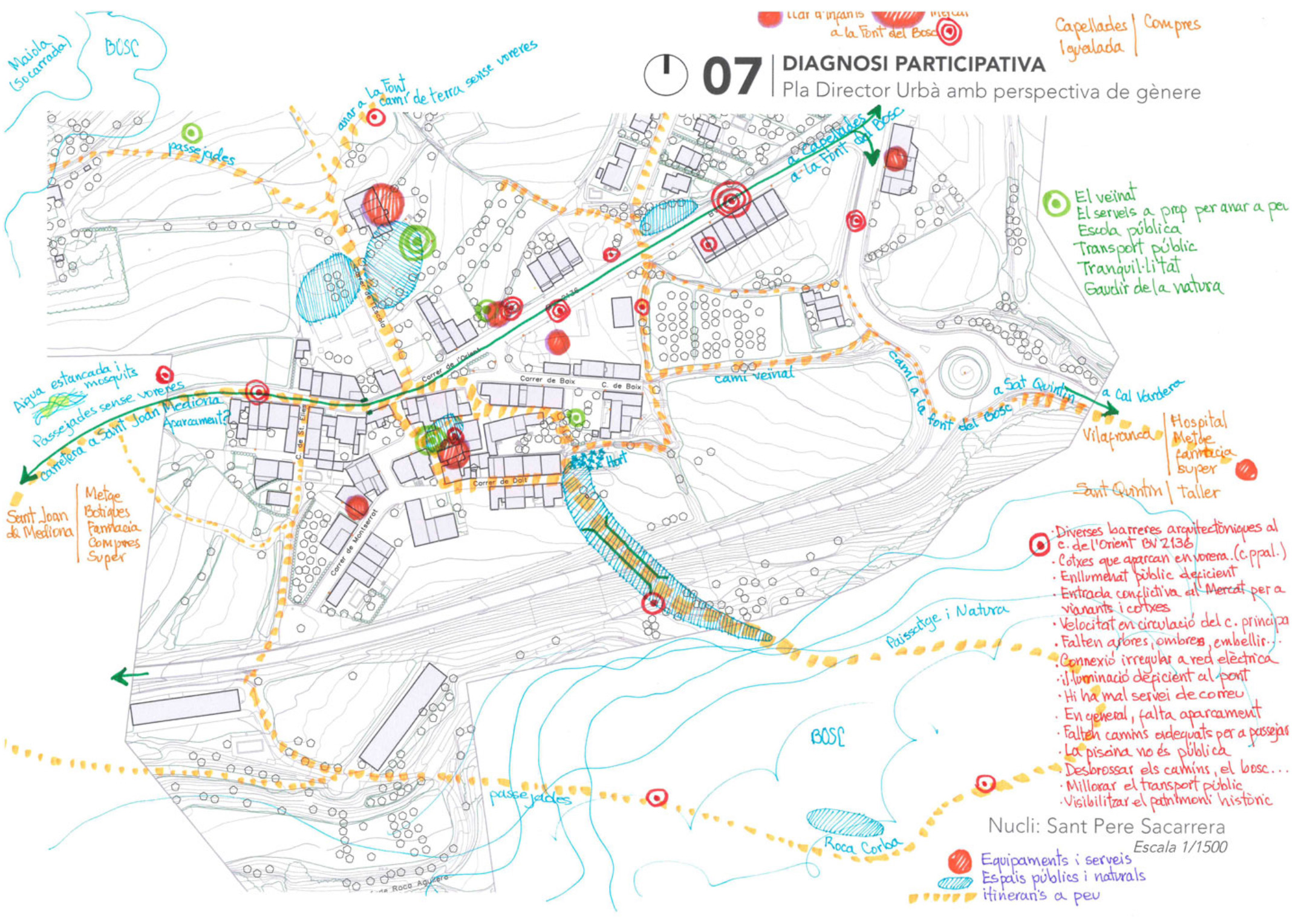
Rather than treating participation as a procedural requirement, these examples advance co-design as a supportive knowledge-producing practice that can challenge the male-normative assumptions embedded in briefs, standards, and spatial typologies. Feminist urbanism has long argued that everyday experience - particularly the embodied, emotional, and temporal dimensions of navigating the city - constitutes a form of expertise [8]. Women’s diverse narratives of fear, avoidance, and adaptation are spatial data that reveal how environments function in practice. This data then emboldens architects and urban designers to act with purpose, respectful of the needs of those the public space will serve.
What methodologies might we employ to understand lived experience at night? One such critical framework is Doreen Massey’s theory of Power Geometry [10]. Massey argued that space is constituted through relations of power that enable some groups to move freely while constraining others. Applied to night-time urbanism, Power Geometry reveals how the ability to inhabit darkness is itself a privilege. Men, particularly those aligned with dominant social groups, often move through nighttime space with relative autonomy. In contrast, women, girls, and other marginalised groups experience heightened surveillance of their own behaviour and curtailed spatial freedom.
Co-design, a participatory design approach, when informed by feminist principles seeks to redress gender inequality and elevate lived experience as design expertise, redistributing epistemic and spatial power. When women and girls participate in defining problems and generating solutions, they expose the micro-geographies of safety and danger that conventional planning overlooks: poorlylit desire lines, bus stops without escape routes, dead frontages that eliminate refuge, or thresholds where harassment routinely occurs. Translating these insights into architectural parameters can reshape environments in ways that support presence rather than avoidance. Importantly, such changes are not limited to token gestures like brighter lighting, increased surveillance or police presence. Feminist design emphasises relational safety: the presence of other people, diversity of activities, and spaces that support care, waiting, and rest.
Massey’s framework also cautions that co-design does not automatically equal empowerment. Power relations persist within participatory processes themselves. Whose voices are heard, whose knowledge is deemed credible, and who ultimately controls implementation remain critical questions. For co-design to translate into spatial change, it must occur early enough to influence briefs, budgets, and land-use decisions, and must be supported by institutions capable of acting on its outcomes. Otherwise, participation risks becoming symbolic, leaving the underlying geometry of power intact. State systems must support the opportunity for meaningful engagement and the dynamism that is required for context-specific approaches to emerge, led by the community [11].
Architecture has the capacity to materialise social relations. Nighttime environments are not neutral backdrops but active agents shaping behaviour and perception. By treating women’s diverse lived experiences as architectural knowledge, designers can move beyond security-driven responses, applying defensible architecture strategies [12], such as Safety by Design, toward supportive environments that promote inclusivity. Democratic planning processes in the form of gender-responsive co-design do not simply act as a tool for consultation but a mechanism for producing new forms of space - spaces where the right to the night is not aspirational but meaningfully constructed. Co-design then becomes an architectural practice of spatial justice, promoting equitable access to the city after dark.
The design of our cities stems from long-standing patriarchal power systems that govern urban development, influence financial allocation, compound social inequality, and subjugate women. These inequalities are further amplified at nighttime. Within a patriarchal planning system, how can we design safe, inclusive and accessible urban spaces which remain agile to the demands of all genders?
Read

Website by Good as Gold.