
Membership of Type allows unlimited access to our online library. Join to support new research and writing on the design of the built environment.
You can read more about membership here.
Already a member? Login to your account to avail of unlimited downloads.
Membership of Type allows unlimited access to our online library.
Join to support new research and writing on the design of the built environment.
You can read more about membership here.
Individual Membership Fees
Individual membership is available on a monthly or annual basis.
The fee is €10/month or €99/year.

If every building tells a story, the lettering on its facade is the opening sentence. It’s the street number that tells you you’ve arrived at the correct place, the badge of authority on a headquarters, the epigraph that announces the LIBRARY, HOSPITAL, or COURTHOUSE. Facade signage provides a semiotic main entrance for users and passers-by, and is one of a building’s most prominent and visible features. And yet it’s frequently the part executed with the least skill and care. Exiled to the limbo of provisional costs, epigraphs and facade signs are usually dashed off by juniors or cranked out in-house at signage fabricators and slapped onto the completed building like a sticker. Often a building’s designers have no say in how it’s signed. And often, it shows.

It wasn’t always this way. The making and use of letters was once a standard part of architectural education, and a number of architects have made significant contributions to typography in their own right. Bertram Goodhue’s Cheltenham was one of the most popular typefaces of the early twentieth century. Peter Behrens treated architecture, industrial design, and graphic design as strands of a single gesamtkunstwerk, and the Behrensschrift he used for AEG is widely considered the first branding font. Frank Lloyd Wright, Arne Jacobsen, and Charles Rennie Mackintosh all developed distinctive letterforms that could operate as harmonious components of their work. And the iconic stacked facade letters of the Dessau Bauhaus were created by Gropius’s fellow architect Herbert Bayer.

This is not a Trad Guy plea for more Sainsbury Wing-style lapidary inscriptions (brilliant as Michael Harvey's lettercarving was) or a typographer’s special pleading for more prominent letters. (If anything, poorly designed facade signs are usually too shouty.) It’s a plea for recognition of type as a small but integral element in the making of good buildings. If architects are no longer trained to use letters, perhaps they should collaborate with people who are: sympathetic practitioners who understand how they can contribute to and support a building’s aims. While a few budgets allow for extensive typographic systems and even bespoke typefaces, for most jobs the fees charged by competent typographers are less than the costs of fabrication. For commercial clients, a building may be the most expensive brand statement they'll ever make; it's worth it to set aside a few quid to see that brand is properly represented. And when the budget only allows for off-the-shelf signage solutions, a trained typographer can help ensure these are chosen well and applied appropriately. What’s wanted is not a bigger role for letters in architecture, but a more considered one.

Present Tense is supported by the Arts Council through the Architecture Project Award Round 2 2022.
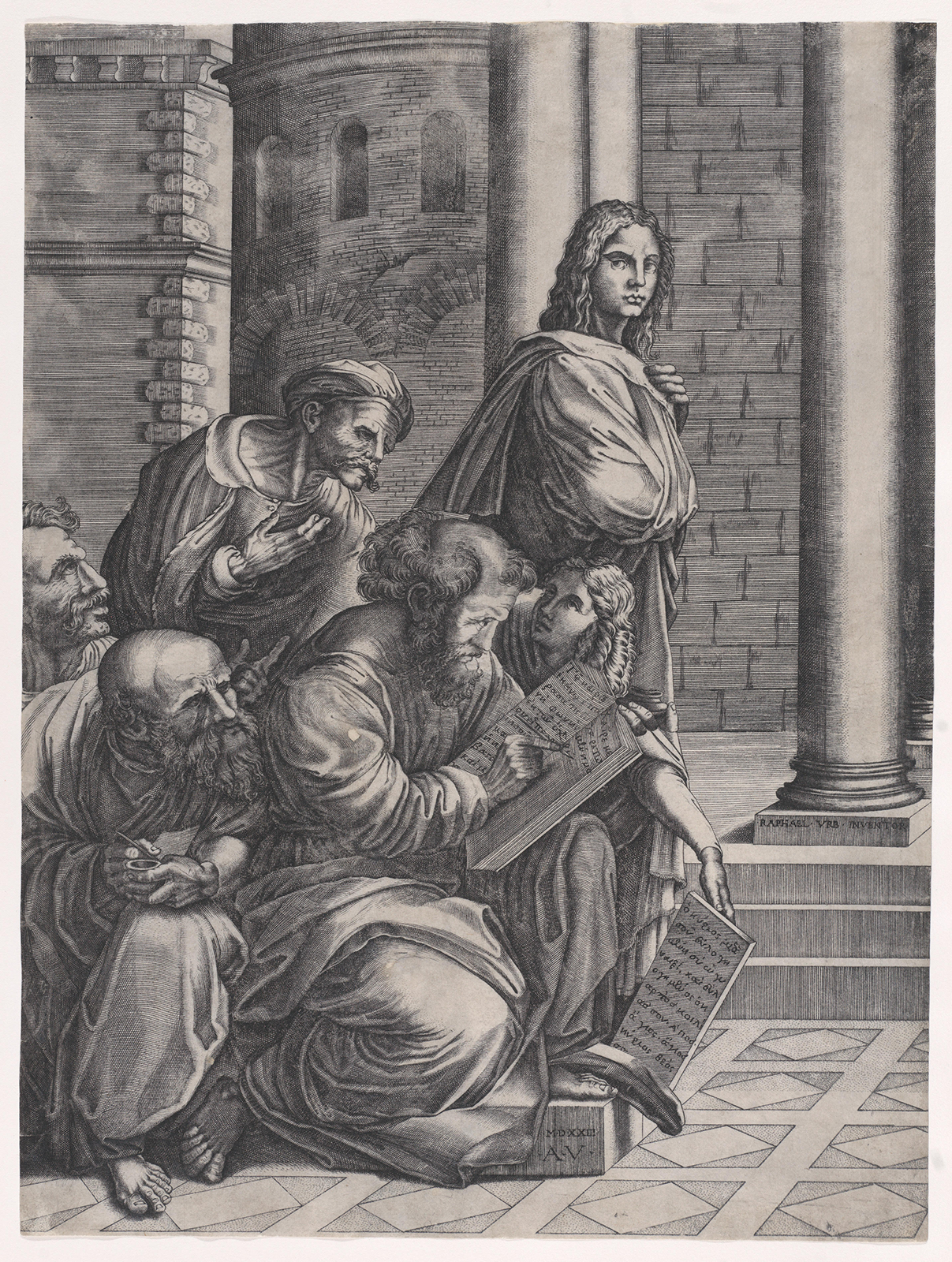
1. Source: A Practice for Everyday Life.
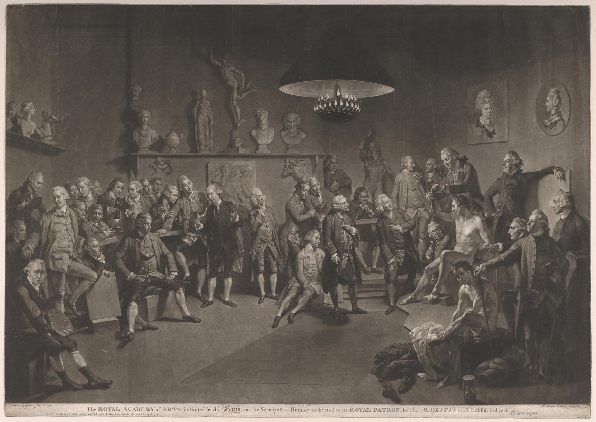
2. Source: St Peter's Basilica and Love in the City of Lights.
3. Source: Pentagram and Wallpaper.

By the time I turned sixteen, I had already let most of my hobbies fall by the wayside. Art, basketball, ballet, theatre – all of these are things which I used to love but inevitably gave up one-by-one as I entered adolescence. The common denominator being that I felt I simply could not spare the time for these hobbies. But this begs the question as to why a young girl might find herself worrying about time – why did I feel like I was in a time deficit at such a young age? The sad reality of this is that there are a number of things which eventually lead young girls to disproportionately abandon hobbies and pastimes in their adolescence. Social pressure, self-consciousness, and time redistribution toward academics are all contributing factors. However, there was a hidden undercurrent of something deeper and far older as I slowly let go of my hobbies; an internalisation that devoting time and dedication towards the pursuit of something simply for its own pleasure is a luxury which is less available to me as a woman [1] [2].
When the time came for me to choose a career path at the too-young age of eighteen, I weighed my options carefully. The pressure to choose wisely was immense, and there was a massive push for women to pursue careers in STEM. While I was good at maths and physics, I also loved art, music, and languages. Sadly, I dismissed those subjects which might be viewed as more ‘feminine’, such as art or music, feeling that as I was lucky enough to be good with numbers I ought not to waste it [3]. I was conflicted – that part of me which had loved art and drawing was calling out for something more creative, yet I pushed myself towards sciences and engineering. When a teacher suggested architecture to me, it almost seemed too good to be true – the perfect marriage between creativity and calculated logic. And so, knowing almost nothing about the profession, I began my journey through architecture school.
To many, the image of the eccentric, ‘gentleman architect’ is a familiar one [4]. An artist figure, sketchbook in hand, running his hand softly over board-marked concrete. In fact, I might argue that the image of the eccentric architect is a romanticised one, perhaps to the point where it risks becoming comical – the architect who dream-walks through his building at night, scrambling for a pencil in the early hours with a new design in his head. Architects have long been characterised by their sacrifice, passion, and devotion to their craft – their work coming before all else. This attitude continues to permeate through all stages of the profession, from early years in architecture school and late into successful careers.
As I made my way through my undergraduate studies, the years were defined by long days, late nights in the studio, and weekends spent burning the midnight oil in the library. While I loved my time in studio and had a great relationship with my peers, I began to realise that I was struggling to find time for much else other than my studies. Once again, my hobbies took a backseat. Meeting friends and pursuing any extra curriculars become increasingly more difficult. In my early years in university, I worked a part-time job, and I was warned by many older students and even a few tutors that I might need to quit once things got busy. I remember thinking how ridiculous an idea that was, how should I be expected to pay my way without working? The truth is that this attitude stems from a much older and dangerous idea; that architecture is not a job, but instead an avocation, historically accessible only to those who could afford it.
Architecture first developed as a pursuit in the 15th century, divorcing itself from the previous medieval vocation of the ‘master builder’[5]. In the renaissance, architecture positioned itself as a ‘gentleman’s profession’, quickly distinguishing itself from building trades and labour by aligning more closely with intellectual endeavours. Training comprised of extended periods of travel, unpaid apprenticeships, and long periods of study. Thus, architecture was positioned as an artistic calling. Depending heavily on patronage and private income, it emerged as a passion first and a career second. Availability and financial flexibility heavily influenced the profession as it developed, meaning dedication was measured not by only skill, but by a willingness to prioritise the craft. It is these assumptions, then, which resulted in a profession that disproportionately excluded women, as they had less access to independent wealth, educational opportunities, and professional networks.
When I finished my undergraduate studies and entered the workforce, I was eager and enthusiastic to leave the long days in studio behind me. The idea of a ‘nine to five’ seemed a dream and I could not wait to reclaim my evenings and weekends. I am lucky enough to have worked with some amazing women over the last few years, who continue to amaze me in their hard work and dedication within this male-dominated field. However, certain realities of the profession became more apparent to me. As it turns out, the long hours and late nights were far from over. It is true that architecture is a discipline of passion, and the profession today balances being both a cultural contribution, and a skilled trade which sustains the built environment. There is a thin line, however, between admirable devotion and a potentially dangerous culture of sacrifice which risks exclusion.
The road to architecture remains long and expensive. Many years of study are followed by professional experience and further professional examinations. Emerging graduates are offered long hours for low salaries, while entering a world with a near inaccessible housing market and record high costs of living. When sacrifice is romanticised, and long hours are reframed as commitment – an assumed requirement rather than an occasional exception – it begs the question of how sustainable the career is in the long run. The expectation that architects will give more time than they are compensated for still persists, sustained by the belief that architecture is a career driven by passion rather than financial necessity.

As women, we begin to recognise that these expectations are not neutral – that a profession built on constant sacrifice quietly determines who can remain, and who cannot. While my university class boasted an equal ratio of male to female students, female representation in architecture drastically decreases at senior levels. Despite gradual moves towards a more balanced gender representation in architecture, I can’t help but wonder if the avocation mindset plays a significant role. The expectation of constant availability, sacrifice, and prioritisation over all else conflicts with career interruptions such as pregnancy, familial responsibilities, and caregiving duties which continue to disproportionately affect women [6]. I am a young woman at the very beginning of my career, and I would be lying if I told you these concerns had never crossed my mind. The expectation of constant availability and sacrifice reflects an outdated assumption of who an architect is. As I approach my thirties, I find myself worrying how sustainable a career in architecture is for me if I want to have children and raise a family.
These concerns feel increasingly urgent in Ireland today. This mindset which views architecture as a 'gentleman’s profession' risks excluding a diverse range of people who are drawn to it. Framing the profession as an intellectual pursuit discredits a skilled career which is highly technical, as well as socially and culturally valuable. I grow increasingly nervous that architecture might become something I may not have the luxury or flexibility to maintain without sacrificing something important. While I love my field of practice, and am passionate about my chosen career, the truth remains that architecture is not my avocation. My job is not my hobby.
In this article, Ciara O’Connell closes our mini-series ‘Drafting Identity’ which focuses on the experience of women in Architectural Education from both personal and professional perspectives, supporting the FIAE movement. Ciara explores the pressures a career in architecture places on life outside of work, and the significant material impacts that places on women, in particular.
Read
Architecture is widely considered to be an incredibly innovative profession. For centuries, it has played a crucial role in shaping our urban landscapes and societies. This innovation and creativity which characterise the profession is first nurtured in the early stages of education. The excitement sparked by entering the first year of university develops into a growing sense of possibility as the years progress. However, for an industry so forward-thinking, the issue of how women fit into its identity structure has very much “remained unresolved” [1].
When I began my own career almost 7 years ago, it appeared to me that the field was largely male dominated, particularly in the way architects were celebrated and publicised. Many of the names, faces, and projects I encountered were male, which subconsciously shaped my understanding of who typically occupied positions of recognition and authority within the field. While my academic experience in architectural education has been shaped by a diverse student cohort, my professional experience beyond academia has highlighted an underrepresentation of women among firm partners, associates, and managers.
The statistics, supported by RIAI-sponsored research, show how gender balance in architectural education unfortunately doesn’t directly translate into female representation at the top level in the country. In Ireland, only 30% of registered architects are women, with as little as 16% occupying principal or leadership roles in RIAI-registered practices [2]. The issue, however, is not the lack of ambition, ability, or women’s desire to enter the field. Recent decades have seen a growing number of women choosing architecture as a career path with Irish architecture schools achieving gender balance since the 1990s. Since “as many women as men qualify with degrees in architecture”, it's important to question where the deeper rooted imbalance, often referred to as the “leaky pipeline", comes from [2]. This metaphor is often used to describe the disappearance of women from career pipelines as seniority increases.
Historically, architecture has been shaped by a culture of extreme working hours and a lack of flexibility, where wearing tiredness as a badge of honour is often expected. From under-recognition to pay gaps, the challenges women face within the profession remain largely unchanged. A survey discussed by Dervla MacManus and Katherine O’Donnell in the ‘I am an architect’, gender and professional identity in architecture research article reveals a clear contrast in how gender is perceived in architectural careers. While 45% of men reported that gender has no influence on their career thinking, only 2% considered it important. In contrast, 41% of women described it as extremely influential [1].
Since “architectural practice relies on long working hours, homosocial behaviour and creative control”, many women, particularly those with caregiving responsibilities, can find the profession difficult to sustain long term [3]. Those who do reach senior roles however, often receive less recognition in comparison to their male colleagues. From precedent case study lists handed out in universities, to the industry’s most prestigious awards; female architects contributions have not always received equal acknowledgement. The case of Denise Scott Brown is a well-known example of female achievements being overlooked, as she was excluded from the Pritzker Architecture Prize, which was awarded solely to Robert Venturi despite their collaborative work [4].
During my university exchange abroad one of the elective modules offered was titled ‘Women in Architecture’. It was a 5 credit course dedicated specifically to exploring women’s contributions to the field. I was excited to partake, however I equally found myself wondering why this topic needed to be defined seperately. Did the module come to life due to women’s work being significantly overlooked within the mainstream architectural curriculum? What stood out to me the most however, was how fast the class reached full capacity with a waitlist forming as a result. Its popularity suggested a genuine interest among students for a more expansive and inclusive learning environment, regardless of gender.
For students like myself who seek female role models on a daily basis, representation is incredibly valuable. Recognising and celebrating women is not only symbolic, but it actively shapes the aspirations of young women entering architectural education. How we record the history and achievements of all architects, despite gender or background, not only influences our understanding of the profession today, but also advocates for a more inclusive architecture culture. Conversations like these create a future that is not abstract or unattainable, but something women can see themselves embodying.
Experiencing representation first hand has deepened my understanding of what it truly means for women in practice. When I began my first role in the professional world of architecture, it came with the stress and imposter syndrome that often accompanies any new position, particularly your first. This pressure however, felt significantly eased after being assigned a female mentor; someone who reflected my background and experiences in a professional setting. This experience made a meaningful difference for me from the very first day. Her guidance played a key role in helping me settle in and grow in confidence. It also helped me understand the potential of my career development and the direction I wanted it to take. It allowed me to set goals that felt both tangible and exciting.
Recognition, representation and mentorship at the top tiers of the profession carry immense value. Having experienced it first hand, I understand how powerful it can be, not only for confidence building, but also for shaping drive and ambition. An industry with a ‘leaky pipeline’ misses out on a wider range of perspectives and approaches where design can suffer as a result. I hope the topic of a more inclusive architecture culture becomes an everyday norm – particularly for those starting out as young professionals, trying to navigate the uncertainties of their early careers in the pure chaos of the world of architecture.
In this article, Julia Przado continues our mini-series ‘Drafting Identity’ which focuses on the experience of women in Architectural Education from both personal and professional perspectives, supporting the FIAE movement. Julia explores the underrepresentation of women in senior roles within the architectural profession, and the importance of representation, recognition and mentorship.
Read
The architecture crit as an assessment format has remained largely unchanged since its inception. Conceived in the 1850s by the Beaux-Art School curriculum, it marked a shift from apprenticeships at ateliers toward academic degrees at University [1]. Despite the profession itself undergoing numerous transformations, this aspect feels stuck in time. When asked to write a piece about my experience in architectural education, ‘crit culture’ immediately came to mind.
Ahead of presenting in front of a review panel, there is a feeling of discomfort. A mental note to speak loudly, stand tall and stay concise, all while getting your concept across. The week before a review becomes a drawing marathon, racing to complete and pin-up the ‘finished’ product. The dread of the crit is experienced by all students, but there is an unstated imbalance between male and female students.
It is undeniable that students learn important life skills through preparing for a review, such as public speaking and presenting under time constraints. However, the crit environment emphasises a particular kind of thinking where students are encouraged to present as the ‘masters’ of their project [1]. It is formal and declarative. By contrast, design work is rarely this way. It is a slow process that emerges from continuous iterations and thoughtful decision making. It is often difficult to portray the experiential intentions of the project during a review. It is much easier to defend a rigid master plan than it is to discuss the way a space feels and the material process behind it. These are gendered qualities of architectural presentation. Masculine ideas perform well in crit environments; they are more structured and easier to make coherent in a drawing. Whereas the feminine attributes fall to easier scrutiny; they are attributes rooted in process, feeling, and care.
During a crit, your work is performing and you become part of the performance to the audience of jurors. In this becoming, there is an inequality between male and female students. As the body plays a part in this performance, it is worth analysing the historical role of the female body in visual culture and performance. There has been a gendered dynamic present throughout visual culture in western society. Laura Mulvey diligently outlines this in her work ‘Visual Pleasure and Narrative Cinema’ [2]. She describes how men are accustomed to seeing themselves portrayed as the protagonist and driver of the narrative, whereas women are accustomed to seeing themselves as the spectacle. These dynamics are internalised and can affect the way in which each gender approaches a review.

The lack of female role models in architectural discourse feeds this narrative. For decades, we have idolised the ‘starchitects’, who are predominantly male. It is no wonder women have trouble self-identifying with the protagonist in this profession. Typically, architecture schools place female students standing before a predominantly male, seated jury. This has a significant impact on female presenters, as it reinforces a spatial hierarchy where emphasis is placed on performance and presentation, rather than broadening conversation and engaging with people on a horizontal level. This structure is another aspect of the crit that is culturally coded in gendered norms of masculinity.
Established in an all-male environment, the review feels outdated and disconnected from the realities of working practice, where design is collaborative and dynamic, and involves multiple actors working together. The crit forces women to bend our femininity to fit a system that has historically excluded it. It perpetually legitimises gender norms within the realm of architectural education. With this, we lose an opportunity for critics to establish a self-identity with us and our work, and this generates a bias. I experience an immediate wave of calmness on review day when a female reviewer is present. It marks an opportunity for self-determination.
Elisa Iturbe said, within her paper ‘Women & The Architectural Review: the Gendered Presentation of Architectural Work’, that “Our femininity is rejected when we must speak loudly and boldly to an audience of predominantly men” [3]. In feminist pedagogy, relationships between teachers and students exist on a less vertical plane. Power and knowledge become shared [4]. Last semester, instead of the standard presentation format for our Architectural Technology module, a group of 4 female students, Julia, Róisín, Ciara, and I, came together to create a podcast to share our work with each other and our peers. This conversational and collaborative discussion was deeply beneficial to all of our learning. It removed the hierarchy associated with a presentation, and felt rooted in feminist pedagogy.
A crit established in an all-male environment is adversarial and performative, favouring bold ideas, structured drawings, and encouraging a ‘master’ mindset. A crit reimagined by an all-female group of 4 becomes a collaborative dialogue for sharing ideas. Hierarchies are removed and time is given to explain process and materiality. Architecture itself creates the physical and cultural framework in which we as a society exist and progress. Architectural education should be no exception. No aspect of it should perpetuate gender biases.
In this article, Kate Crowley continues our mini-series ‘Drafting Identity’ which focuses on the experience of women in Architectural Education from both personal and professional perspectives, supporting the FIAE movement. Kate discusses ‘crit culture’ in architectural education and the impact that dynamic has on women, in particular.
Read

Website by Good as Gold.